Friday, 28 October 2011

Urban Flaneur- Walking the City

Our homework task for this week was to allow our self to become an urban flaneur and document our experiences and findings with images. We were told to trace a journey we often take at our home town, onto a map of Brighton and go out and take the journey. Although this should have been effective to help us find things as we would have been walking around roads unfamiliar to us, the only few routes I ever took in my home town, when projected onto a map of Brighton only seemed to take me along popular roads like West street or along housing roads that failed to inspire me on my wanders. I was unsatisfied with my findings, so I headed out on my own accord into the lanes and told myself to just aimlessly wander around and search for exciting, quirky, strange objects, colours, textures that caught my eye.

To document my findings I went out and bought a disposable camera, rather than using my own digital slr camera. I felt a disposable camera would be better suited for this exercise and it would encourage me to not look through the view finder and frame my images, and instead just snap photos based on reaction rather than precision.
Below, our a view images I took on my phone which focuses on textures, and then a selection of images of the processed photos from the disposable camera.


Urban Flaneur Take 2- Walking the Lanes:


The rest of my images are photos I got processed from a disposable camera and will appear in my scrap book, however, when playing about and viewing the photos I came across some cool ways to document them onto here by taking a photo of a series of photos. I feel the photos came out surprisingly well, as the range in colours, textures and styles within the batch of photos all seem to be competing to stand out and attract the viewers eye the most.


Wednesday, 26 October 2011

Examples of illustrative art.

For further research I looked into examples of illustration that we come across in our everyday life. Before i never really acknowledged it, however, once I set out to find it, I came across numerous examples of its use in CD covers, as shown below and also how it is used in a few adverts. The one that struck me the most was its use in the nationwide advert that appears on the screen of a cash point (pigeon hole), however, the photo of it didn't come out well and I struggled to find it online, which was a shame, but never the less it shows that the use of illustrative art is current and appears around us a lot more than we originally think.


Saturday, 22 October 2011

Kinetic Typography

I began to delve deeper into the realms of animation and began to explore the range of endless means and techniques of producing a piece of animated work. Mary gave us an insight into what is known as 'kinetic typography, so I felt his would be a good place to start.

Kinetic typography to use the online definition is "is an animation technique that requires the mixing of motion and text to express ideas using video animation. This text is presented over time in a manner intended to convey or evoke a particular idea or emotion".
Kinetic typography instantly hit me as something exciting, fresh and inspirational. I enjoy the sense of freedom that is giving to the words as they move about the screen in an array of transitions and how the text can add so much more meaning or emphasis to quote/ phrase taken from the audio. What no doubt helped my enjoyment of kinetic typography was that a lot of the better examples I came across were from some of my all time favourite films; Snatch, Lock Stock and Pulp fiction. I found that knowing the film, made the motion graphics even more fascinating, as they provided me with the same data/ audio that I have experience numerous times by watching the films in a new, fresh form of media. Although our society is not known for our adaption to change, I feel within the digital world, being able to adapt and take in change through different forms of media will only make you enjoy and appreciate how good and inspiring pieces of work are, and that is exactly what has happened for me.

Below are a few examples of my favourite pieces of kinetic typography found on Youtube.


This is one of my all time favourite scenes in Lock Stock and I feel the use of motion graphics really emphasis the dramatic and cutting edge tension within the scene. The use of splat graphics to portray the idea of blood being spilt is so simple, yet so effective and also the transformation and rotation of the explanation marks, to create the allusion of them daggering into the screen is incredible and a technique I would indefinitely incorporate into my work, if I chose to follow this lead of animation.
I also feel the choice of colour scheme is spot on and really adds to the cutting edginess of the scene. The harsh contrast between the rough black font and the bright yellow background ensures the viewers eyes are transfixed on the motion of the text, it then reverses half way through to black background and yellow text as the subject of the audio becomes deeper and darker. I feel this is an effective and simple way to use colour to emphasise the change in tone within the subject of the audio.


I find this one of the most interesting examples of kinetic typography because of its subject. There is a range of mediums within this, first of all a film about the development of a website, which a scene has then been adapted into an animation film of motion graphics, oh the digital world of today.
Focusing on the animation itself, I think its excellent. I like the attention to detail of matching the colour schemes, its simple but it adds that house style and continuity through the range of media forms. One of the aspect of this animation that I really enjoy and would love to experiment and try to incorporate myself, is the fast paced, whip style movement that adds to the vibrancy and excitement of the audio and also how the words interact with one another by fitting within each other, moving and breaking off of one another, solely one word dropping from one sentence to fit into the next and how some words are brought to the forefront to add and accentuate the specific points within the audio.


I carried on searching around youtube, looking at hundreds of typo animations in the hope of picking out little details/ transitions/ effects etc that grabbed my attention. The above animation is from a Jay-z song, which again shows another incorporation of a different medium. What stood out for me in this animation and inspired me to think that kinetic typography is something I really want to get into, is the way the words seem to whip out towards the audience and trails behind a blur to add emphasis to the speed of the lyrics.
I think its a clever and effective effect as it plays on the shock factor within the audience and consequently captures their attention instantaneously.

Illustration

I have always had a growing interest in using illustration within digital media. As my editing confidence and skills has developed and my accessibility to better software, I have been able to experiment more with illustration and experiment how I could incorporate into some of my digital media work. I have a connection with a design student at LCF (London College of Fashion) and during the summer I visited one of her exhibitions. All of the work was fantastic, however, what really caught my eye was the simple use of illustration within pictures that just added some eccentric and stand out to her photographs over other peoples. Below are a few example of the images that caught my eye;


I loved the effect the illustrative drawings had upon the photos, therefore, I asked for her to teach me the process and went ahead and had a play myself. Below are a few examples of my first attempts;

Thursday, 20 October 2011

Beauty and the Beast- A major stepping stone in animation

We were sent to go out and research the film 'Beauty and the Beast' due to its amazing animation that aided as a stepping stone in terms of the production of computer aided animation movies. 


I thought I would go about some background research into the production side of the movie, Beauty and the Beast and see long, what problems aroused and what was needed in order to created such a masterpiece of animation. I found that the film took nearly four years to produce with the full time help of over about 600 animators, artists, and technicians. There were over 226,000 individually painted cells and over one million drawings. Over 1,300 backgrounds were created for Beauty and the Beast. This stat truly amazed me. Before I read this information I understood and appreciate the skills and time and effort it takes to create an animation, however, when I came across this information and saw the gastronomical amount of drawings and backgrounds that are used, it truly dawned upon me the ridiculously high expertise and true amazing-ness of animation. I was inspired, shocked, almost overwhelmed to find that a film made and targeted for a young audience was actually a life changing and dramatic step in terms of the expertise and exquisite attention to detail needed within production of animation.


Beauty and the Beast mixed traditional animation and select scenes of computer animation together to create new visuals of grandeur for the audience. The computer animated assisted scene that seemed to capture people's imagination the most was the ballroom scene.


"The ballroom sequence features the first computer-generated colour background to be both animated and fully dimensional," says Jim Hillin, CGI Artistic Supervisor forBeauty and the Beast. "What this means is that the background is literally moving and the animators had to animate to it in much the same way that they worked with the live action composites in Who Framed Roger Rabbit. This gives the advantage of sweeping camera moves and perspectives as well as theatrical lighting that would otherwise be impossible. It introduces live action techniques into the animated world. Here the camera plays a very important role in establishing the mood and helps us to experience what the characters themselves are feeling."Hahn saw the ballroom sequence as a defining moment in the movie.

"The ballroom sequence is the bonding moment of the film when the two main characters finally get together," says Hahn. "For us as filmmakers, the computer offered us a way to get heightened emotions on the screen and more dramatic effects than we could have gotten conventionally. It allowed us to move the camera around and take a look at the room instead of just looking at a flat piece of artwork. Technology as a whole is an extension of our fingers, hands, and minds. Computer graphics let us go beyond what we can currently achieve with pencil and paper or paint and a brush."
Computer artists and technicians worked alongside the layout, art direction, and background teams to achieve the results of the ballroom scene. Even the dimensions of the ballroom played a major role in creating the final look.

  • 72-foot high ceilings.
  • 184 feet from door-to-door with a width of 126 feet.
  • 28 wall window sections.
  • A 86 X 126 foot dome with a mural (that was hand painted then applied as a texture map)
But the ballroom wasn't the only extensive use of computer-assisted animation in Beauty and the Beast. The movie's climactic song, "Be Our Guest," also made use of computers. Dancing plates, forks, goblets, bubbles, and the chandelier were created with computers.
"The main purpose of CGI is to build and animate things with the computer that will aid and enhance what is going on with the hand-drawn art," says Hillin. "Our biggest challenge is to incorporate the two things and make it seem as if they belong together. If we get too real or the perspectives are too perfect then it doesn't fit in with the rest of the film."
In the case of Beauty and the Beast both the traditional and computer animated environments melded near flawlessly to create a magical and enchanting environment for millions of people worldwide to enjoy.


How?

During my searches around the web looking for cool animations, pictogram's,illustrations etc I came across this new short film by BLU an ambiguous animation painted on public walls on Vimeo.


I was mesmerised when I saw this animation, the idea is hugely ambitious but the visualisation and quality of animation is fantastic. I am attracted to the idea of journey of 'MUTO' as it travels, transforms, fades, becomes reborn etc. Much like my first task of my journey from my house to uni, the idea of a journey interests me and I feel it works well with animation. It encourages the audience to lose themselves within the flow of the animation and just follow the journey of what is on screen, whilst forgetting everything else around you.

This playful animation, certainly had my head spinning though, even now I cant seem to fathom how the animator was able to perform this within a 3d space. Hopefully someone can help soon before I go mad!!!

Whilst in class, we spent time looking through each others findings and research material, which led me to come across Jan Svankmajer a Czech filmmaker and animator, prolific in the computer generated world of animation. Svankmajer is a self-labelled surrealist, known for his surreal animations and ways of portraying character. What I notice was the above animation that I found seems to be directly influenced by the work of Svankmajer.


'MUTO' in BLU's video seems to take a direct inspiration from the developing journey of the clay formed character within Spankmajer's above animation, in how the body grows, transforms, develops and how body parts, like the head of MUTO morph and grow out of one another's mouth. all of these techniques used by BLU show how he was clearly influenced and inspired by the surreal nature of representation used by Spankmajer.

Wednesday, 19 October 2011

Luxo jnr- Pixar

Luxo Jr. is the first animated film produced by Pixar Animation Studios in 1986. The film was released to mark Pixar's establishment as an independent film studio and to demonstrate the kind of things the newly-established company was capable of producing.
What inspires me the most in this short animation is the simple, yet extremely effective use of personification of the two desk lamps. the use of stereotypical head shakes and dominating stance of the larger lamp is an accurate and easily recognisable characterisation of a parent or guardian, whilst the smaller in size, more vibrancy and erratic movement of the other lamp is effectively characterised to portray a baby/ young person.
Similar to why I like and appreciate the artistic merit of pictogram's, the simplistic movements and creative decisions within this film are so simple and easily recognisable, yet they carry such heavy connotations and descriptions.

Dora the Explorer


To get the course started, we were sent away to explore the world around us. To think and observe the world in a way different to how we are use to, and look out for patterns, themes, colours, texts etc that caught our eye. Recorded below is some of the items, themes etc that caught my eye.


"Apple has lost a visionary and creative genius, and the world has lost an amazing human being...Steve leaves behind a company that only he could have built, and his spirit will forever be the foundation of apple".
Transformed the digital age of life changing technology and software.

I then decided to record my observations of the car journey from my house to Uni. What struck me the most during the journeys was the traffic signs and the symbolic meaning behind them. The simplicity of pictogram's used in road signs inspires me. I find it amazing how, although, as a society we take them for granted and barely register them into our thought process, their importance and value is high. Pictogram's are so simple yet have created a worldwide code/ language, which when we think about it, is truly inspiring.


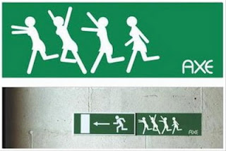
I went on to develop my idea of pictogram's used in car signs to look for pictogram's used for humour in public places, on the web etc. Below are a few examples that caught my eye;


What I realised when I was investigating into road signs and the use of pictogram's in commercial and public places is that pictogram's are often used to convey basic messages and almost always without any sense of expression. I started to think that this is most likely a reason for why we often notice road signs but never fully take them in. As there are often no expressions to take in, our mind seems to just register the basic meaning, function and then forget.

What I like about adding humour into pictogram's is that it gives the designer an opportunity to add a sense of life, to basic black shapes and negative spaces. Such subtle humour is something I love and I feel by incorporating humour into a pictogram can result in a wonderful thing.

Monday, 17 October 2011

Dragonball z


Dragon ball z is a Japanese manga series written and illustrated by Akira Toyriama. It was originally serialised in Weekly Shōnen Jump from 1984 to 1995; later the 519 individual chapters were published into 42 tankōbon volumes by Shueisha. Dragon Ball was inspired by the classical Chinese novel 'Journey to the west'. It follows the adventures of son goku from his childhood through adulthood as he trains in martial arts and explores the world in search of the seven mystical orbs known as the Dragon Balls, which can summon a wish-granting dragon when gathered. Along his journey, Goku makes several friends and battles a wide variety of villains, many of whom also seek the Dragon Balls for their own desires.
Dragonball z has a very unique style of animation, that makes it stand alone as an inspiring work of art. On a content level the story combines humour, racism and action-oriented plots in a subtle but effective way. On a design side, the manga style illustration has become a leading forefront for cartoon and animated illustration. The ridiculously fast paced action is mind boggling and the dramatic, in your face style is emphasised by the combination of bright bursts of colours.


Although I find the concept of dragonball z and the still manga style drawings an interesting and clever style of illustration, I have a quite a strong dislike on the whole for this style of animation. I find cartoon style animation like Dragonball Z and shows like Futurama as immature and pointless. I class myself as someone with a good sense of humour, and watch a lot of comedy shows, stand ups and films, however, I feel my humour is more satirical and subtle humour, whereas, I find the humour and content of this style of animation as weak and immature. 


With regards to my final project, I indefinitely know that I will not even begin to consider the idea of using or incorporating this style of animation. Although I appreciate the artistic merit, I just cannot bring myself to watch and even begin to like Dragonball Z.